This inaugural Factual post starts from first principles, by laying down some of the fundamental foundations necessary to start reasoning about audio signals. I will then build on these principles in the posts to follow.
The time domain
An audio signal is an oscillating phenomenon: it is defined by a quantity that alternatively increases and decreases over time while keeping in the vicinity of some central value.
Out of the infinity of shapes that an audio signal can take, probably the simplest is a pure tone, also called a sine wave from the name of the mathematical function that it describes. Here is an example of a sine wave:
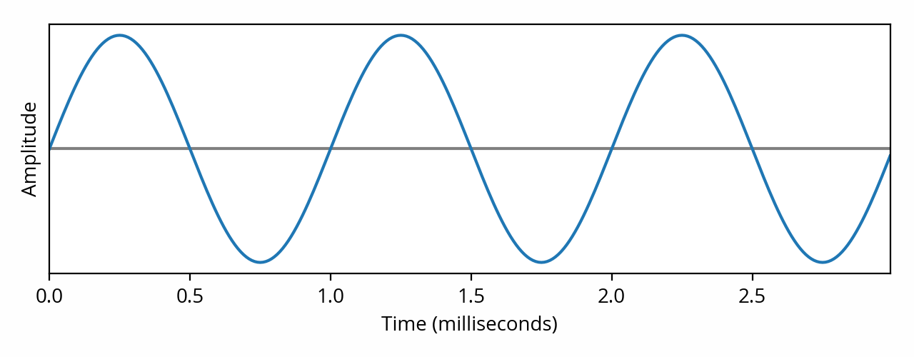
The horizontal axis is time, which is why it is often said that this representation shows the signal in the time domain (another term is waveform). The above signal oscillates around the central value represented by the horizontal line. According to the horizontal scale, this particular signal repeats once every millisecond: this is its period, also known as the cycle. Said differently, the signal repeats one thousand times per second: it has a frequency of 1000 hertz. In order to be audible, the frequency of the signal must sit between 20 Hz and 20 kHz: this interval is known as the audible range of the human hearing system.
In the image above, the height of the signal is known as the amplitude (the term magnitude is also used). I deliberately left out the vertical scale and unit because they depend on the context — more on this to follow in the post about audio realms. Another complication is that the “height” of the curve can be defined in multiple different ways — which are explored in a separate post as well.
Amplitude is related to loudness, in the sense that if we take a signal and increase its amplitude (by amplifying its oscillations), the human hearing system will perceive the signal to be louder. Likewise, if we decrease its amplitude (by attenuating), it will be perceived as being quieter.
Caution: This relationship between amplitude and loudness does not necessarily hold when comparing signals that have differing frequencies. This is due to the fact that the human hearing system does not perceive all frequencies as being equally loud [note] The effect can be quantified using equal-loudness contours. [end note] . For example, if you listen to a 30 Hz tone and then to a 2 kHz tone of equal amplitude, the latter will sound much louder than the former.
Of course, most audio content is not a pure tone. In practice, an audio signal for, say, music, might look like this:
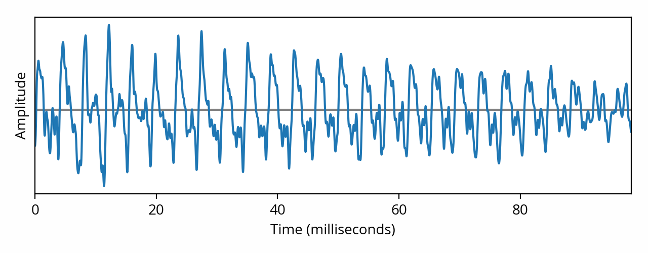
As the above image shows, a musical signal is way more complex than a pure tone. And that’s not even a complicated musical piece — this is pianist Joohyun Park, solo, playing a single note [note] Specifically, this is one of the first notes played at the beginning of the Allegro track from The Music of Battlestar Galactica for Solo Piano. [end note] . What’s really problematic, however, is that this representation doesn’t seem to relate to our perception at all — to the naked eye, it doesn’t look like a musical note played on a piano.
The frequency domain
In order to make sense of such complex signals, we need a better way to look at the data. Fortunately, the above signal can be decomposed into a number of pure tones of various frequencies and amplitudes, thanks to the superposition principle. The mathematical tool used to do the decomposition is called the Fourier transform. For example, if we were to apply the Fourier transform to our first pure tone example, the result could be represented as follows:
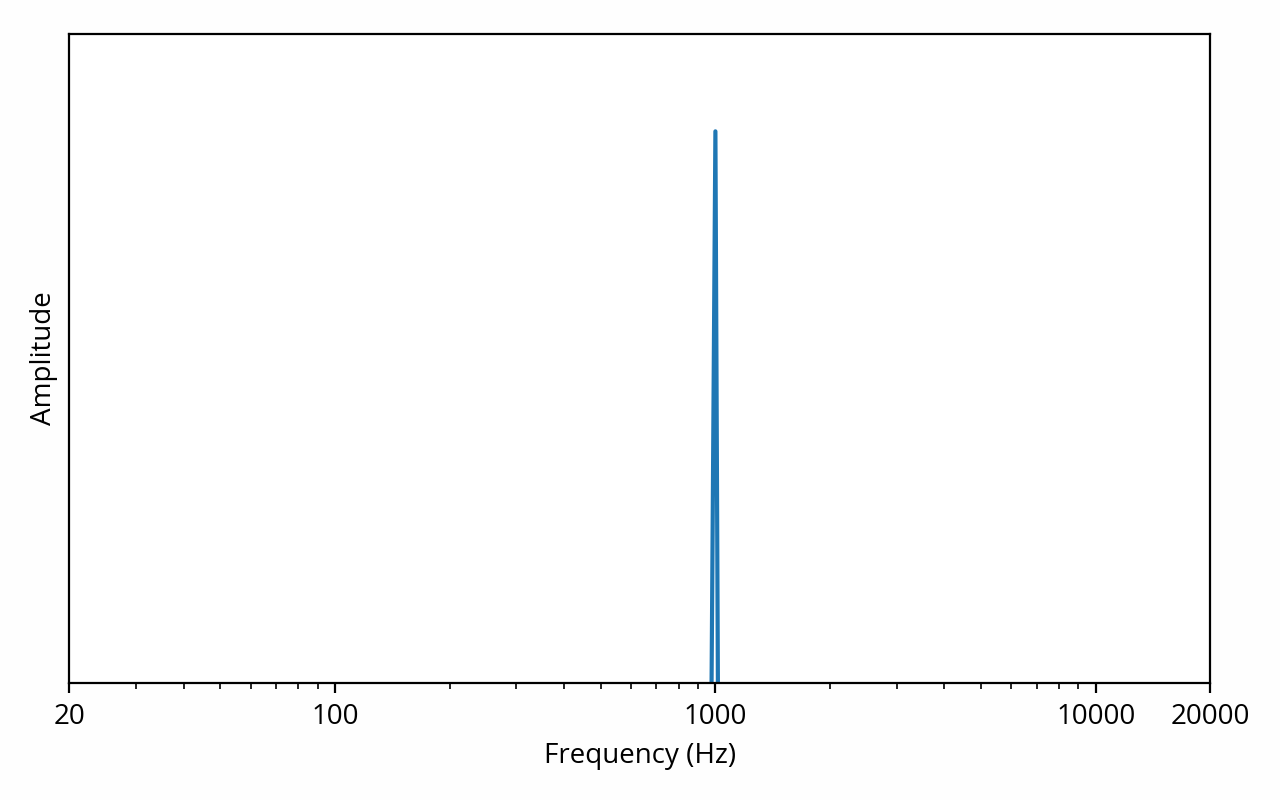
The vertical axis is still amplitude, but the horizontal axis has changed — it now represents frequency. This representation shows the signal in the frequency domain, or, in other words, it shows the spectral density (often simply called spectrum) of the signal.
A keen eye might have noticed that the horizontal axis is using a logarithmic scale, which is commonplace for this type of plot. This scale provides a better view of how we perceive sound: it is very easy to hear the difference between a 100 Hz tone and a 200 Hz tone, but the same cannot be said about 10000 Hz and 10100 Hz tones, even though the difference is still 100 Hz. This is because in the former case, there is a 100% increase, while in the latter case, the increase is only 1%. In other words, the human auditory system perceives relative change, as opposed to absolute change [note] This is consistent with other human senses, as predicted by the Weber-Fechner law. [end note] . The term octave is used to describe a frequency factor of two; for example, the range 2 kHz to 8 kHz is two octaves wide. The term decade is also sometimes used, and describes a tenfold increase in frequency.
The above plot is showing us that the signal can be decomposed into a single 1 kHz tone, but we already knew that. What’s more interesting is what happens when we apply the Fourier transform to the musical signal:
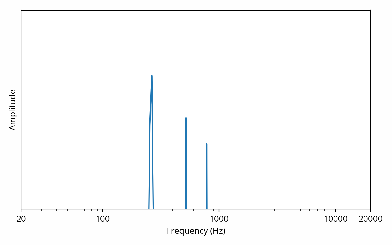
Here things become interesting. This plot is telling us that our musical example can be decomposed into a 260 Hz tone with high amplitude, combined with 520 Hz and 780 Hz tones of lower amplitude.
Such a result is typical of a recording of an instrument playing a single note. The first tone, at 260 Hz, is called the fundamental and indicates the pitch of the sound, in other words the note being played, C5 in this example. The 520 Hz and 780 Hz tones, because they are multiples of the fundamental, are called harmonics. They are interpreted by the human hearing system to help determine the timbre of the instrument. If the same note was being played on say, a flute or a violin, the frequency of the fundamental would be the same but the relative amplitudes of the harmonics would be different.
This is interesting because we can directly relate what we see on the plot to how the sound will be perceived, i.e. what the signal sounds like. Of course interpreting this data still requires some effort — most people wouldn’t be able to tell “of course that’s a piano playing a C5” just by eyeballing the above image. Furthermore, if I had used a more complex example (such as a symphonic orchestra playing in unison), the spectrum would have been just as unreadable as the waveform. Nevertheless, in practice, the spectrum often provides a much more useful view from a perceptual perspective. This is why audio engineers will often ignore the time domain, instead focusing their efforts on the frequency domain.
Frequency-domain data can be converted back to the time domain using the appropriately-named inverse Fourier transform. One might wonder if any information gets lost during these conversions. From a purely mathematical point of view, the answer is no, but there is a catch. The above plots do not show the full output of the Fourier transform. In reality, the result of the Fourier transform includes amplitude information (which is shown above) and phase information (which I omitted). Amplitude determines the strength of the constituent tones, while phase indicates which part of the waveform cycle occurs at a specific point in time. As long as phase information is not discarded, it is possible to recover the original waveform, intact, simply by applying the inverse transform. That said, aside from a few specific scenarios (such as signal summation), phase is not nearly as prominent as amplitude in practical audio discussions, which is why I won’t dig further into it in this introductory post. I will revisit this topic in a later post.